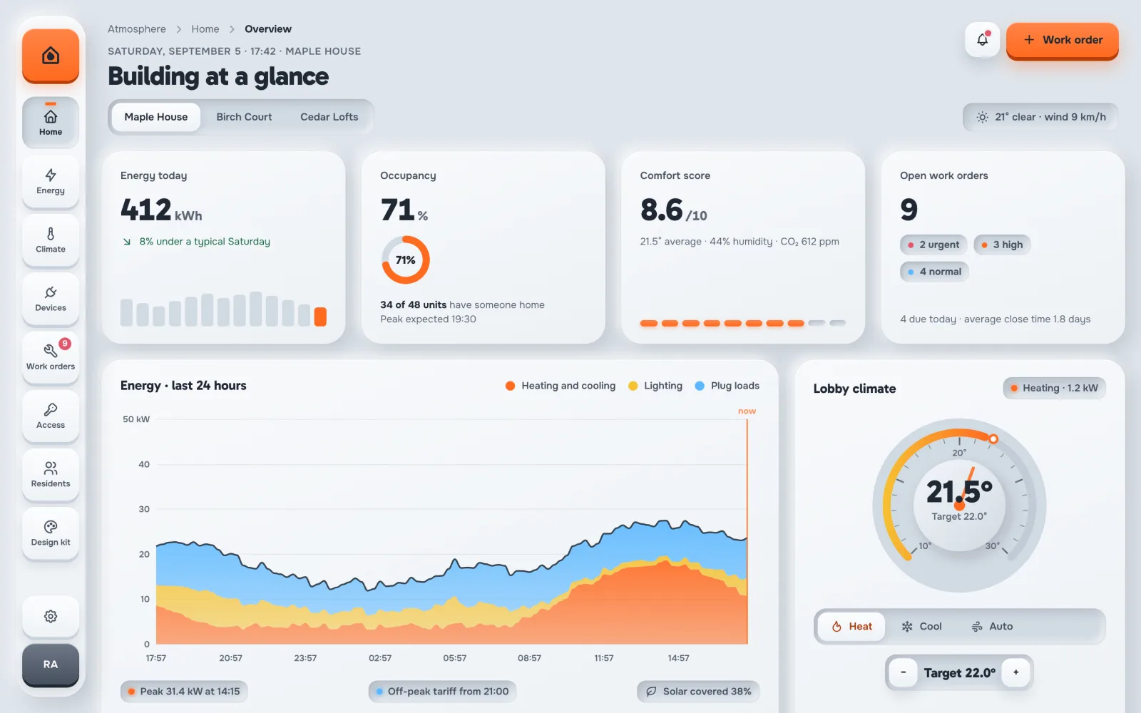
Atmosphere is an admin template made of one pale material, lit from one
direction. Buttons are keycaps that stand 5px proud and travel 4px when you press
them. Inputs and status sit in carved wells. There are no borders: depth does the
work, and dark ink keeps every word easy to read.
The demo is Hearth, the system a property team uses to run Maple House: energy,
climate zones, devices, work orders, door access and residents. Every page reads the
same data, so the numbers agree from screen to screen. Click a screen to open it
live.
Both themes ship in version 1 and share one light model, so a card, a well and a
key look the same in each. The settings below change this page right now, and the
live demo opens with the same choices.
Every control looks like it would click. And it does.
These are the parts a buyer usually has to build alone. In Atmosphere they are
finished, documented and used on real pages.
Seven live settings
Theme, density, light source, key travel, motion, text direction and language.
Each one is an attribute on <html>, saved in the browser and
set before the first frame, so a reload never flashes.
A real thermostat dial
The signature piece is an Apache ECharts gauge with ticks, labels, a needle that
sweeps to its value and a number that counts up. Six chart types share the same
colors and tooltips.
Motion with a purpose
Cards settle in with a 55ms stagger, chart lines draw, numbers count up and
toggles overshoot with a spring. All of it follows
prefers-reduced-motion and a Motion setting.
Command palette
Press ⌘K or Ctrl K to jump to any of the 77
pages. The keypad sidebar opens each group's pages in a flyout.
Charts on Apache ECharts
Line, spark, ring, bars, dial and gauge, plus a wrapper for the rest of the
catalog. Colors come from the theme tokens, and a theme change recolors a chart
in place.
Right to left
Switch the direction in the Appearance drawer and the keypad, tables, forms and
drawers mirror for Arabic, Hebrew or Persian content.
Works on a phone
On a small screen the keypad moves to the bottom of the screen, cards stack, and
every page stays usable with a thumb.
Contrast you can measure
WCAG 2.1 AA in both themes, with every pair measured. Depth never carries a
meaning alone: each status also has a word or a colored LED.
Typed and checked
TypeScript in strict mode, ESLint with accessibility rules, Stylelint and
Prettier. No images to download: the floor plan, camera tiles and QR card are
drawn, so they follow the theme.
Every page
77 pages. No placeholders.
Dashboards, lists, detail pages, forms, apps, sign-in screens, error pages and a
13-page design kit. Every page uses one of five page layouts, so a new page
of your own is quick to add.
30 components and six signature charts on Apache ECharts
Five page layouts: list, record, form, app and sign-in
Light and graphite themes, comfortable and compact density
Every color, shadow, size and timing is a CSS token
Libraries from npm and Google Fonts. No stock photos, no paid assets
Questions
Frequently asked.
Which framework does it use?
React 19 with TypeScript, built with Vite 8 and styled with Tailwind CSS v4. It is
one framework only. There is no jQuery and no Bootstrap.
Do I need a backend?
No. The demo data is typed JSON in src/data/demo/. Replace it with
calls to your own API when you are ready. Forms check their input in the browser
and send nothing.
Which Node.js version do I need?
Node.js 20.19 or newer, or 22.12 or newer. The project pins 22.12 in .nvmrc.
Is there a dark theme?
Yes. Graphite is the same clay in a dark color, with the same light model and the
same accent colors. A System choice follows the visitor's operating system.
Can my users change the look?
Yes. The Appearance drawer lets them change the theme, density, light source, key
travel, motion and text direction, and each choice is saved in the browser. Your own
code can do the same with set() from src/lib/theme.ts.
Can I use it for an app that is not about buildings?
Yes. The layouts are general: lists, detail pages, forms, an inbox, chat, a
calendar, notes and a team page. The building only fills them with data. It suits
IoT and device fleets, energy and utilities, hardware products, health devices and
hotel operations.